Welcome to The Elevator Interface
This interface is designed to ease the use of the elevator, understand and facilitate the actions.
The best attempt has been made to have this design follow the Elevator standards.
Links:
Getting C:
Elevator location:
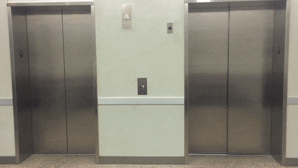
This elevator is from Rawls College of Business Administration, Texas Tech University.
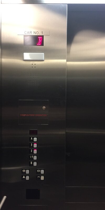
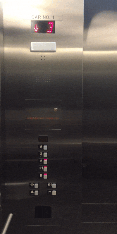
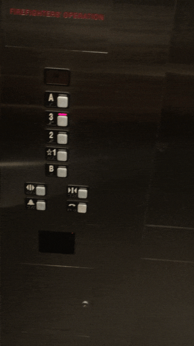
Elevator and its control interface:
Floor B:
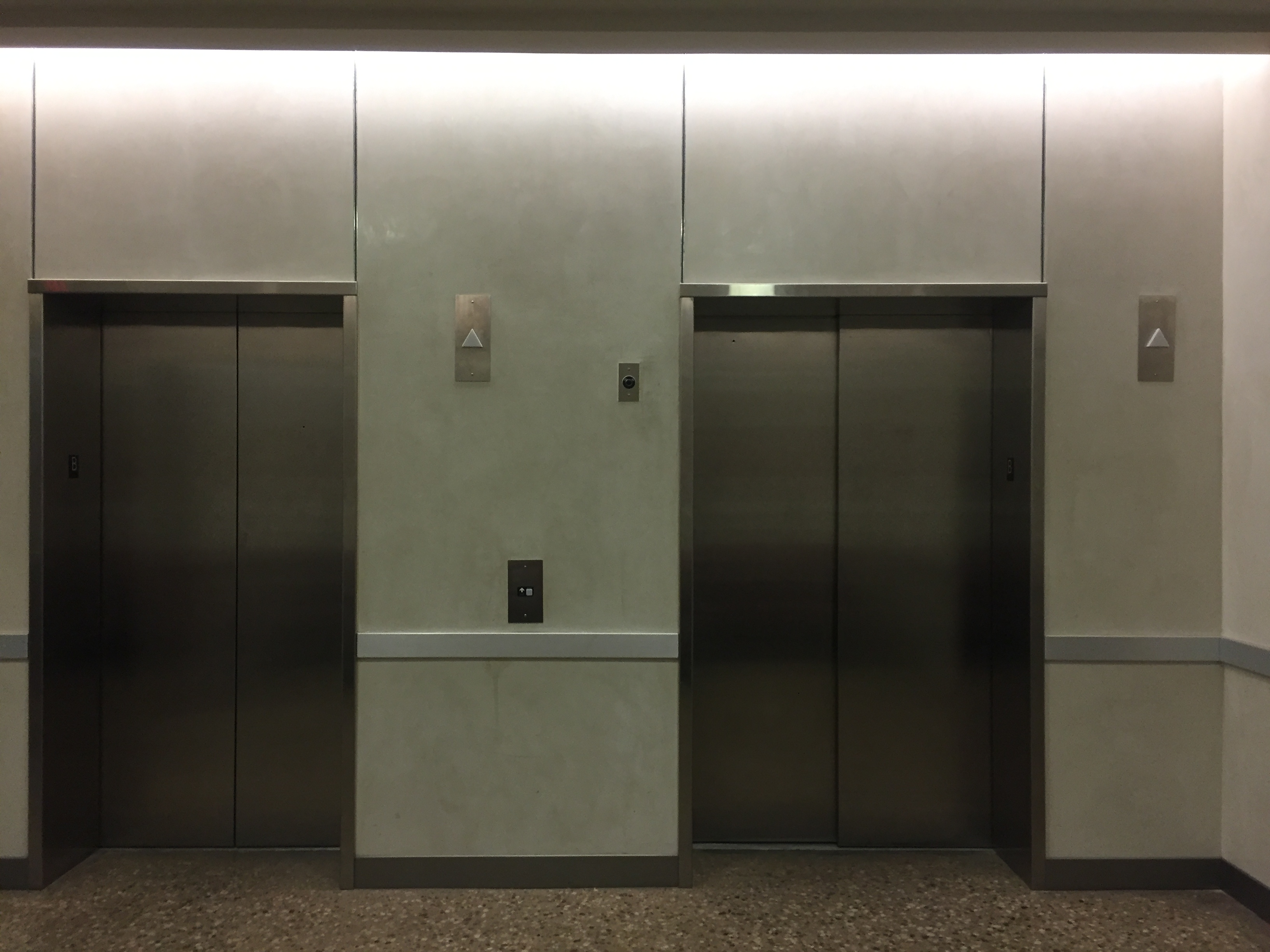
Floor 1 :
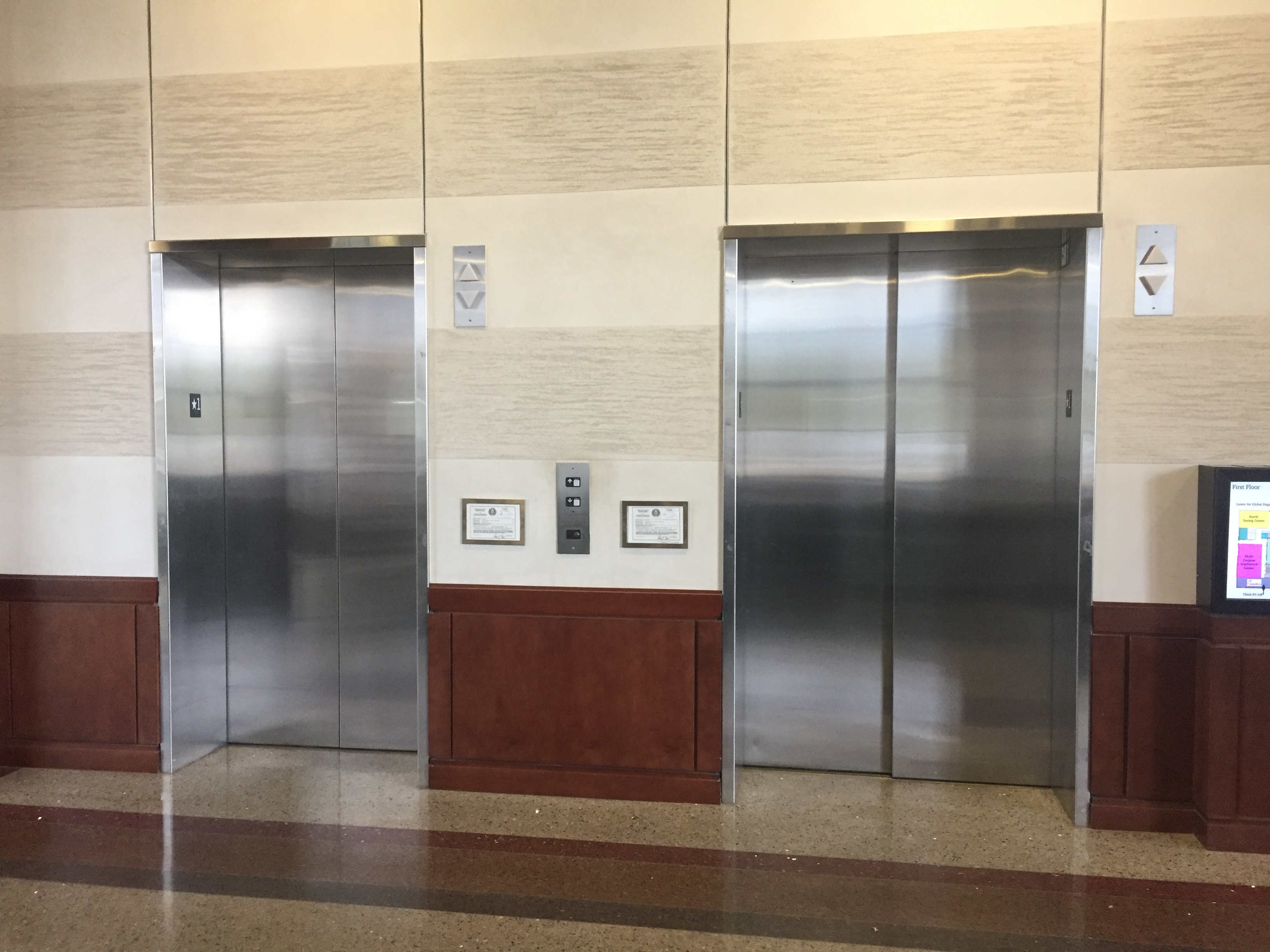
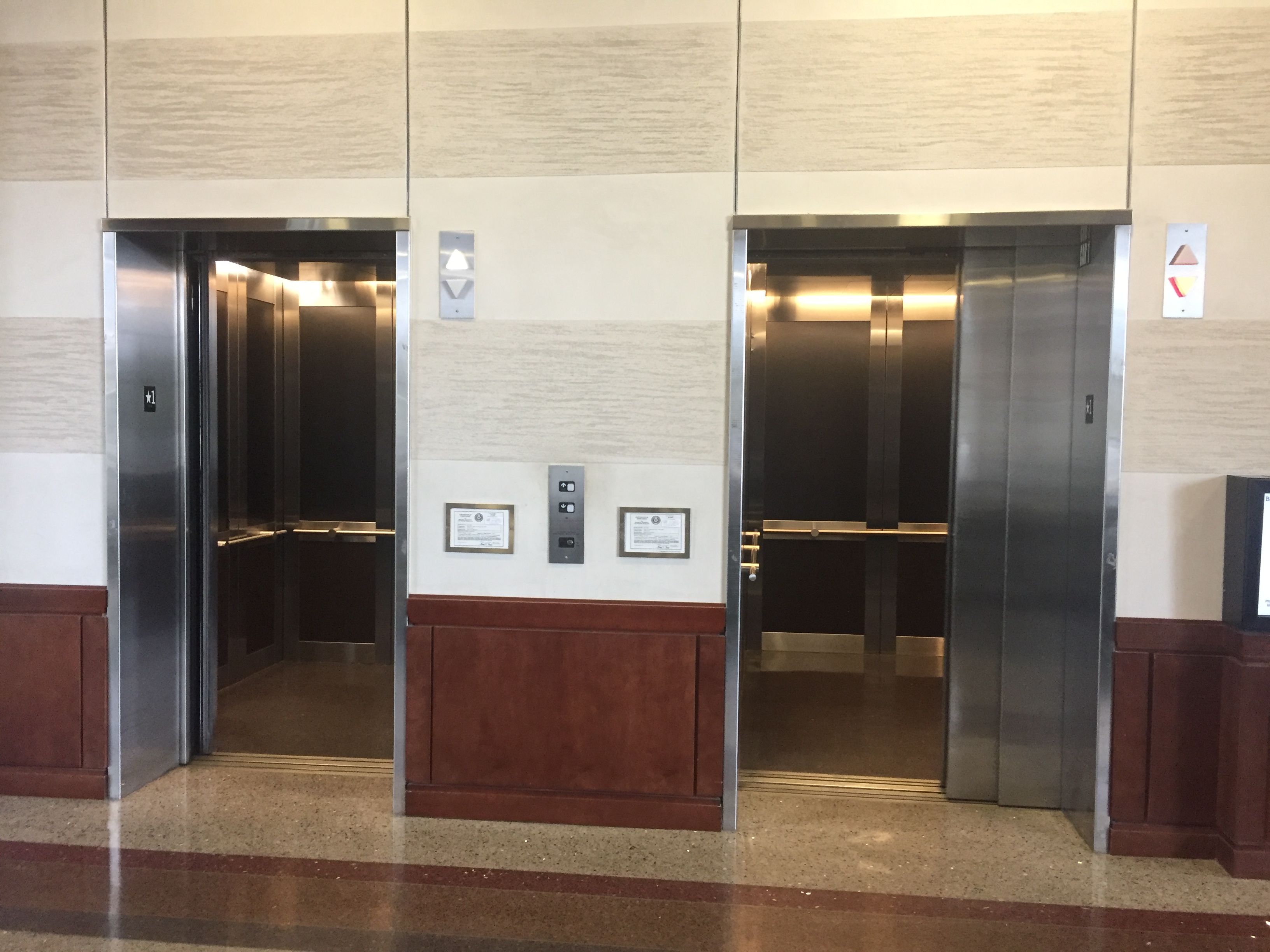
Left elevator:
Right elevator:
Control interface in operation:
Left elevator:
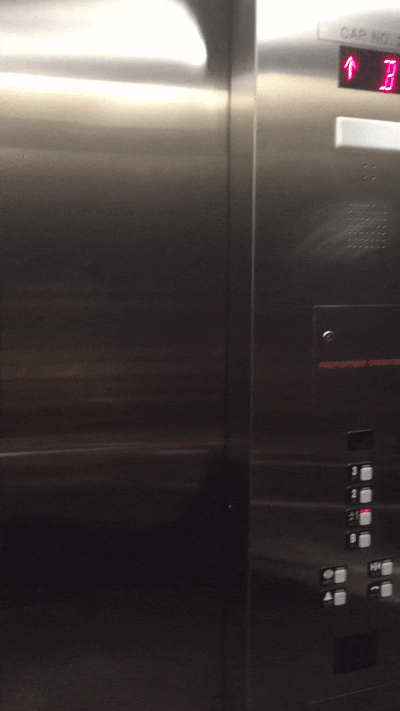

Right elevator:
Both elevators:
Design issues:
- There is only one button for both the elevators.
- The exact status of the current location of the elevator not evident from outside.
- Both elevators have a different number of floor buttons.
Reasons for bad design:
- Upon pressing the button, one of the elevators opens the door and it’s hard to guess which one would open first when the button is pressed.
- The floor, the elevator is currently on, is not indicated
- These have been observed after using elevator a few times:
- Up arrow on the sign on top of the elevator displays white color once for one floor up and twice for two floors up
- Down arrow on the sign on top of the elevator displays red color once for one floor down and twice for two floors down
- Doesn’t support features for people with disabilities
Getting B:
Common uses in an elevator:
- Select the button in the elevator control interface to reach the destination floor
- Choose the floor number or enter the floor number to go to the destination floor
- Open and close the elevator door button
Rare uses in an elevator:
- Emergency call button
- Emergency alarm button
Interface review:
Existing interface review with mistakes:
Though the existing interface provides options like up and down arrow on the outer panel, that doesn’t make it easier to use as only one control interface exists for two elevators
The floor numbers are different in both elevators and it is an additional task if a user enters the wrong elevator
My interface:
The interface is easy to use and supports features for people with disabilities and claustrophobia as well
User interaction sequence of actions:
Existing elevator:
- The user selects the up or down arrow from outside the elevator
- The elevator arrives and the user enters inside
- User closes the door if there is a time lag
- The user selects the destination floor option and selects the door close option on the elevator control interface
- The user reaches the destination floor and steps out after the elevator door opens
My design:
- The user selects the button on touch panel from outside the elevator
- The elevator door opens after it arrives at the current floor
- User enters the lift
- User selects destination floor on the touch screen panel
- In case of emergency, us the emergency call or emergency alarm option on touch screen
How to use the elevator:
Existing elevator:
- Outside control interface:
- Has up, down arrows indicating direction to use the elevator in
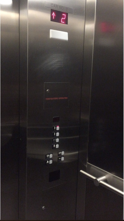
- Inside control interface:
- Has floor numbers as A, B, 1, 2, 3 to reach the destionation floor
- Has emergency call and emergency alarm buttons
- Has door open and close buttons
My elevator:
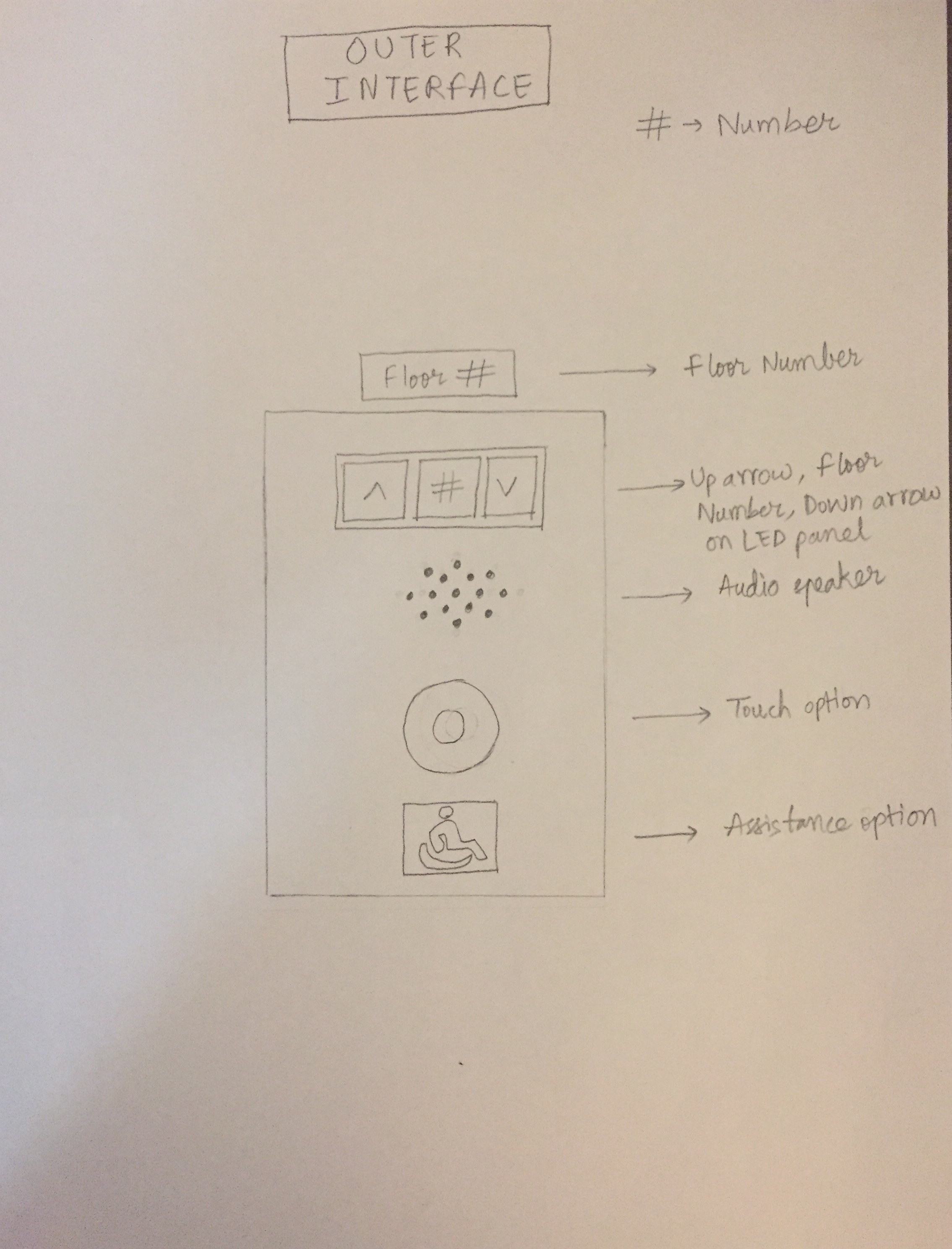
- Outside control interface:
- Has a touch option to call the elevator to the current floor
- Has assistance option indicating any required assistance
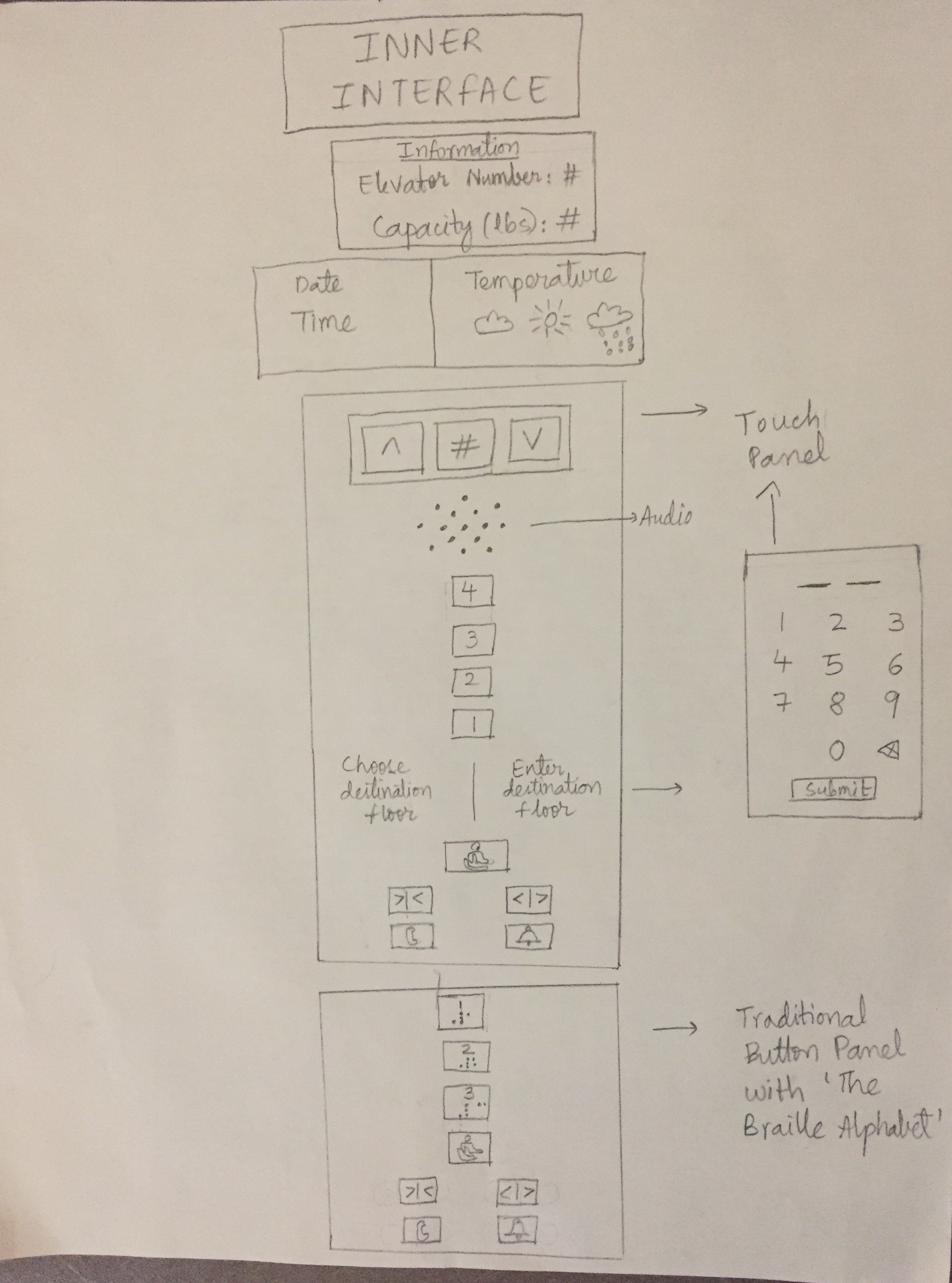
- Inside control interface:
- Touch panel:
- Select or enter floor number to reach the destionation floor
- Select assistance, emergency call, emergency alarm, door open, door close options
- Touch panel:
Elevator providing feedback to user:
Existing elevator:
- Door opens upon pressing up or down arrow buttons
- Door plays a 2-3 second audio after it opens or closes
- Panel above elevator displays white color for up arrow and red color for down arrow along with a beep sound
My elevator:
- Outside elevator touch panel:
- Door opens upon selecting the touch icon
- The door opens upon reaching the current floor of user
- Inside elevator touch panel:
- Select the floor number
- Upon reaching the destination the door opens
Suggestions:
- Have separate outside touch panels for each elevator
- View current floor number for the respective elevator on the touch panel along with other options
- Have an audio output
- Provide support for people with disabilities
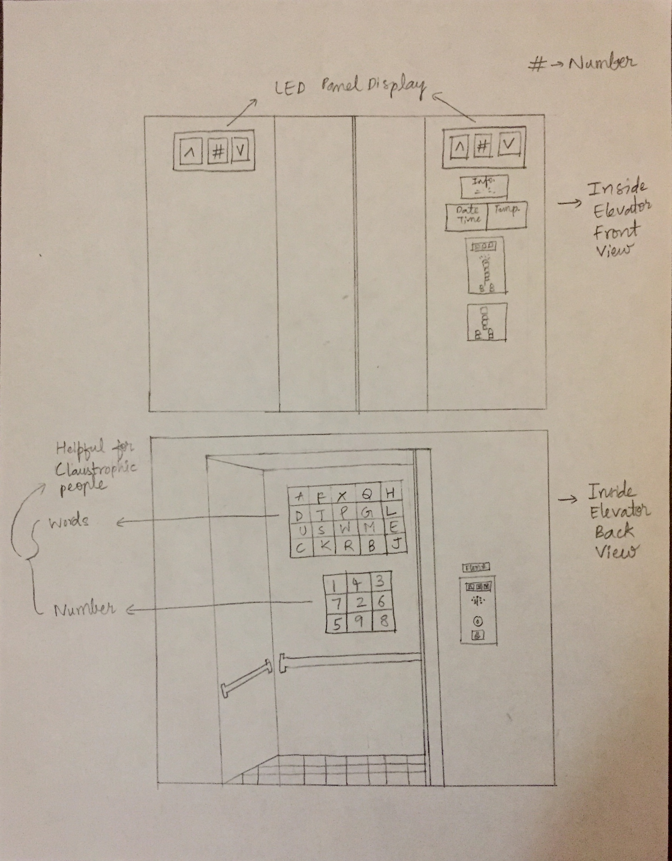
- Provide support for people with claustrophobia by having a picture or design of numbers, alphabets on one of the walls of the elevator
Sketch:
Design decisions:
- Touch panel outside the elevator:
- Elevator status display screen: to view the status of the elevator
- Audio output: for ease and extra assistance
- Touch option: to call the elevator
- Assistance option: for any further assistance
- Inside the elevator:
- Two floor level screen panels:
- Elevator floor number status display on two front panels of elevator
- Elevator information box:
- Description of elevator number, capacity(lbs.)
- General information box:
- Current date, time
- Current temperature
- Main Touch panel:
- Elevator status, floor numbers
- User has three options:
- Choose destination floor from touch panel - Audio plays after person enters the elevator, “You’re on floor number ‘’. Please select your destination floor
- Enter destination floor from the “Enter the destination floor” panel - Audio plays after person enters the elevator, “You’re on floor number ‘’. Please enter your destination floor
- Select destination floor from traditional button panel - Audio plays after person enters the elevator, “You’re on floor number ‘’. Please enter your destination floor
- The assistance option in all three options traverses through all the floor options and calls the elevator - Audio plays when it is chosen as “Please keep pressing until your destination floor number is called”
- Close doors, open doors
- Emergency call, Emergency alarm
- Word and numbers on back view of elevator for people with claustrophobia
- Two floor level screen panels:
Getting A:
Design for touch screen is implemented using HTML, CSS and Javascript
- The touch screen size for outer interface
- In pixels: 900 w x 1280 h
- In code: 25% w x 70% h
- The touch screen size for inner interface
- In pixels: 1050 w x 1680 h
- In code: 28% w x 78% h
The code is written in repository hw1.30.Kulkarni
Folders and files:
- outer-interface - code for outer interface
- inner-interface - code for inner interface
- README.md - readme file
- _config.yml - jekyll-theme-slate
Contact
Copyright ©️ Hriddhi.Kulkarni@ttu.edu
MS in CS, Texas Tech University